Digitech Branding: Chartreuse Color System
Brand Color: Bright Chartreuse (#dfff11) — “Camera Yellow”
Context: Photo digital technician business. Chartreuse represents the yellow marking tape used in dark studios to mark cameras and equipment.
Overview
A comprehensive color system built around bright chartreuse (#dfff11) for a photo digital technician brand. The system balances the extreme brightness and 100% saturation of chartreuse with carefully selected complementary colors and high-contrast neutrals.
Base Color Specs:
- Hex:
#dfff11 - RGB: 223, 255, 17
- HSL: 68°, 100%, 53%
- CMYK: 13%, 0%, 93%, 0%
Approved Palettes
1. Chartreuse Highlight + Neutral Grays (Primary for Data Viz) ⭐
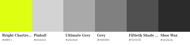
Colors:
#dfff11— Chartreuse (highlight/key metric)#d3d3d3— Light Gray#a9a9a9— Medium Gray#808080— Gray#505050— Dark Gray#2b2b2b— Very Dark Gray (text)
Use: Charts, dashboards, analytics, reports. Chartreuse = primary metric, grays = comparison data.
Why it works: Maximum clarity. Chartreuse draws attention to what matters, grays provide context without competing.
2. Bold Primaries (CMYK) ⭐
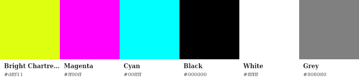
Colors:
#dfff11— Chartreuse#ff00ff— Magenta#00ffff— Cyan#000000— Black#ffffff— White#808080— Gray
Copy-paste list:
#dfff11
#ff00ff
#00ffff
#000000
#ffffff
#808080
Use: Technical precision messaging, color calibration services, minimalist design. Perfect for a photo technician — references color accuracy and CMYK fundamentals. Highest WCAG contrast possible.
Example Data Visualization
Music Listening — Last Month
graph TD
    A[Top Artists - Last Month] --> B[Deathspell Omega<br/>54 plays]
    A --> C[Dream Unending<br/>51 plays]
    A --> D[Oranssi Pazuzu<br/>48 plays]
    A --> E[King Dude<br/>32 plays]
    A --> F[Mgła<br/>32 plays]

    style A fill:#2b2b2b,stroke:#dfff11,stroke-width:2px,color:#dfff11
    style B fill:#dfff11,stroke:#2b2b2b,stroke-width:3px,color:#2b2b2b
    style C fill:#d3d3d3,stroke:#2b2b2b,stroke-width:2px,color:#2b2b2b
    style D fill:#a9a9a9,stroke:#2b2b2b,stroke-width:2px,color:#2b2b2b
    style E fill:#808080,stroke:#2b2b2b,stroke-width:2px,color:#f5f5f5
    style F fill:#505050,stroke:#2b2b2b,stroke-width:2px,color:#f5f5f5
NOTE: (appears Quartz doesn’t fully support color, so the above render here on site is incorrect.) Demonstrates the highlight+neutral gray palette: chartreuse highlights the most-played artist (Deathspell Omega), while the gradient of grays shows descending play counts. The visual hierarchy guides the eye to what matters.
Experimental Explorations
3. Warm Vibrant (Brand Identity Option)
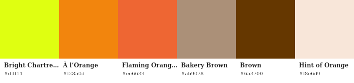
Colors:
#dfff11— Bright Chartreuse (base)#f2850d— À l’Orange (secondary CTA)#ee6633— Flaming Orange (warm accent)#ab9078— Bakery Brown (neutral mid)#653700— Brown (dark accent, text)#f8e6d9— Hint of Orange (light backgrounds)
Use: Brand identity, marketing materials, photography portfolio, social media. “Summer/fall” feel — energetic, warm, approachable.
Accessibility: Brown on chartreuse = 4.5:1 (AA). Brown on Hint of Orange = 5.8:1 (AA+).
4. Tetradic (Dynamic, Vibrant)
Colors: Chartreuse + Purple + Coral + Teal
Use: High-energy contexts, modern/bold branding, creative work. Maximum color contrast and visual dynamism. Four-way color harmony creates balanced complexity.
Why it works: Tetradic schemes distribute hue evenly around the color wheel, creating vibrant tension while maintaining balance. Good for grabbing attention in competitive visual environments.
5. Tints & Shades (Hierarchy & Depth)
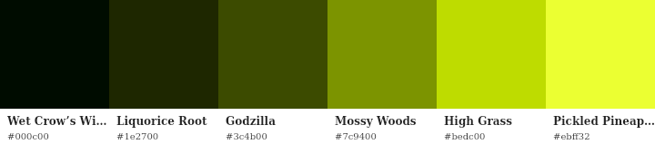
Colors (dark to bright):
#000c00— Wet Crow’s Wing (near-black)#1e2700— Liquorice Root#3c4b00— Godzilla#7c9400— Mossy Woods#bedc00— High Grass#ebff32— Pickled Pineapple
Use: Text on chartreuse (use darkest), backgrounds, layering, heatmaps, sequential data.
Accessibility: Multiple AAA combinations (Wet Crow’s Wing on bright chartreuse = ~18:1).
6. Jewel Tones
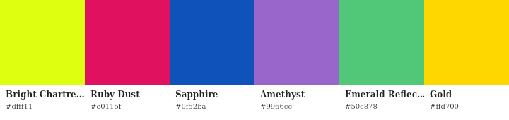
Colors:
#dfff11— Chartreuse#e0115f— Ruby#0f52ba— Sapphire#9966cc— Amethyst#50c878— Emerald#ffd700— Gold
Use: Premium/luxury client work, editorial, high-end photography services. Rich, sophisticated alternative for upscale contexts.
7. Neon Cyberpunk
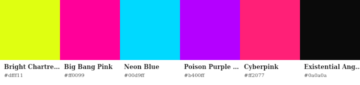
Colors:
#dfff11— Chartreuse#ff10f0— Hot Pink#00ffff— Electric Cyan#bf00ff— Neon Purple#000000— Black
Use: Dark mode, modern/tech-forward branding, nightlife photography, social media. All neons achieve AAA on black (chartreuse on black = 17.8:1).
Color Strategy by Application
Brand Identity
- Palette: Warm Vibrant or CMYK Primaries
- Logo: Chartreuse primary, À l’Orange or Magenta secondary
- Text on chartreuse: Brown or black
- Backgrounds: Hint of Orange or white
Data Visualization
- Palette: Chartreuse + Neutral Grays ⭐
- Key metric: Chartreuse
- Comparison data: Gray ramp (5 shades)
- Text: Very dark gray or black
Technical Messaging
- Palette: CMYK Primaries ⭐
- Use: Color calibration, precision/accuracy statements, technical documentation
Premium Contexts
- Palette: Jewel Tones
- Use: High-end clients, luxury branding, editorial
Typography & Accessibility
Text on Chartreuse
Recommended colors (AAA):
- Black (
#000000): 17.9:1 ⭐ - Very Dark Gray (
#2b2b2b): 14.7:1 - Wet Crow’s Wing (
#000c00): ~18:1
Minimum (AA):
- Brown (
#653700): 4.5:1
Never use: White, light colors, mid-tone grays, pastels
Chartreuse Text
Best backgrounds:
- Black: 17.9:1 (AAA) ⭐
- Very Dark Gray: 14.7:1 (AAA)
- Dark Brown: 4.5:1 (AA)
Never: White or light backgrounds (fails WCAG)
General Rules
- Never use chartreuse for body text (eye strain)
- Always pair with very dark colors
- Use as accent, not primary background
- Test all combinations
Key Recommendations
- Start with Chartreuse + Neutral Grays for all data visualization ⭐
- Use CMYK Primaries for technical/precision messaging ⭐
- Experiment with Warm Vibrant for brand identity warmth
- Consider Tetradic for dynamic, high-energy contexts
- Keep other palettes as exploratory options for specific contexts
The “camera yellow” concept is distinctive and appropriate — lean into the technical precision and creative energy it represents.
Technical Details
Full exploration files: agent/artifacts/color-exploration
Method: Generated using Color MCP server with 31k+ named colors, palette generation algorithms, and automated accessibility analysis.
Color spaces:
- OKLCH for gradients (perceptually uniform)
- sRGB/Hex for web
- CMYK for print
See Also
- Color Theory — foundational concepts in color models, harmony, and perception
- Color Accessibility Metrics — technical reference for WCAG compliance, contrast ratios, and accessibility testing
- Data Visualization for AI Agents — framework for AI-generated charts and visualizations
- Brand Theming for AI Agent Visualizations — architectural pattern for consistent brand identity across visualization tools
- Brad’s Projects
Last updated: 2026-02-26